This project showcases my approach to designing a functional and intuitive dashboard in Figma, with a focus on delivering an effective MVP under tight constraints.
Filiatix is a go-to marketing platform for optimizing lead generation processes, committed to helping companies manage partnerships and build connections more effectively. The project lacked a budget for extensive user research, and the primary goal was to quickly launch a Minimum Viable Product (MVP). My task was to design the core interface for a traffic management platform based on provided mockups and a series of' interviews with the product manager.
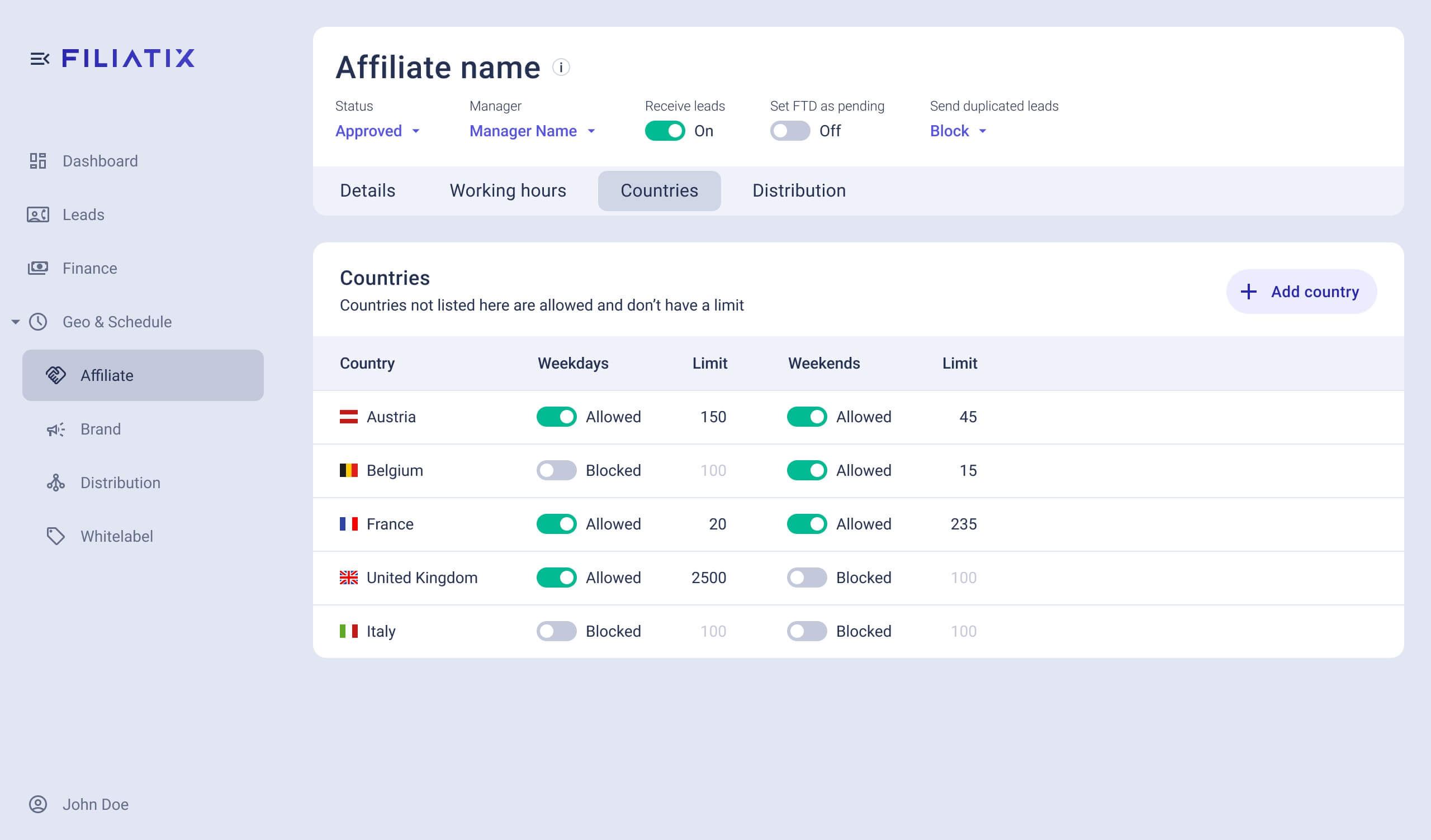
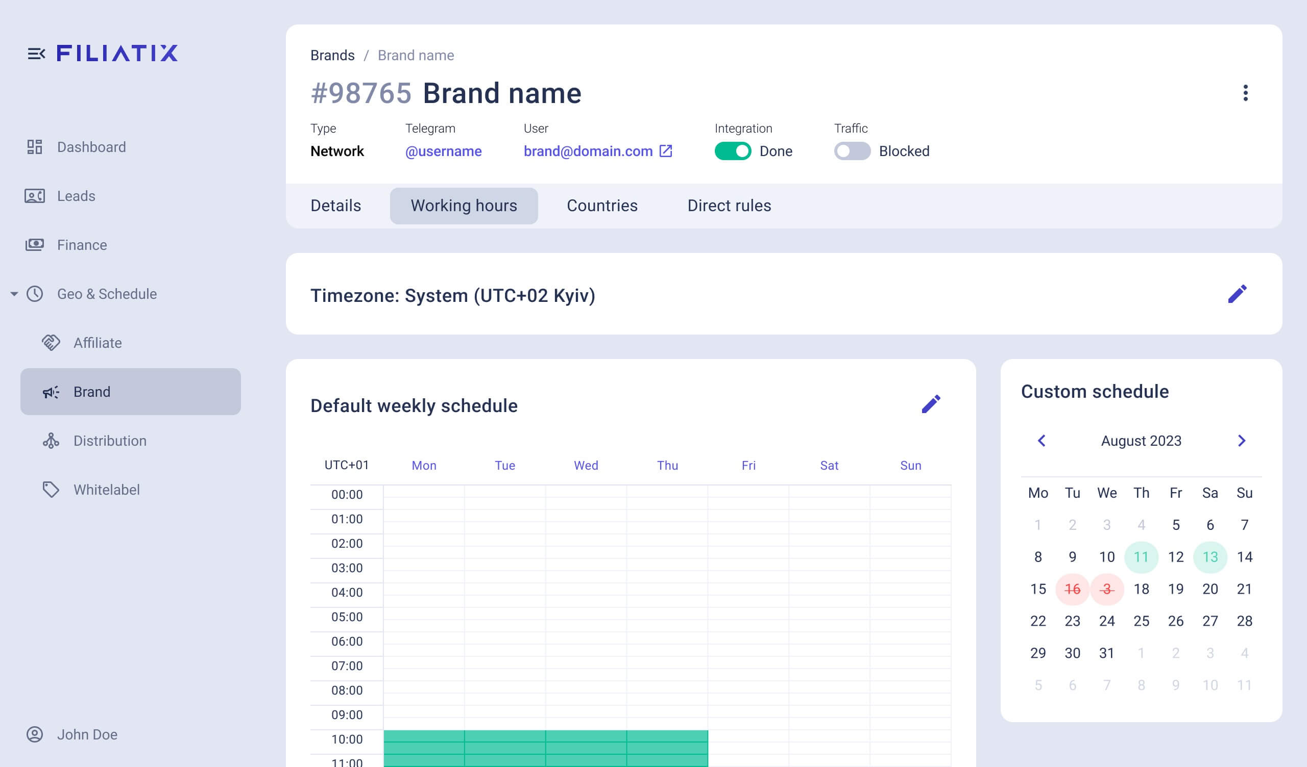
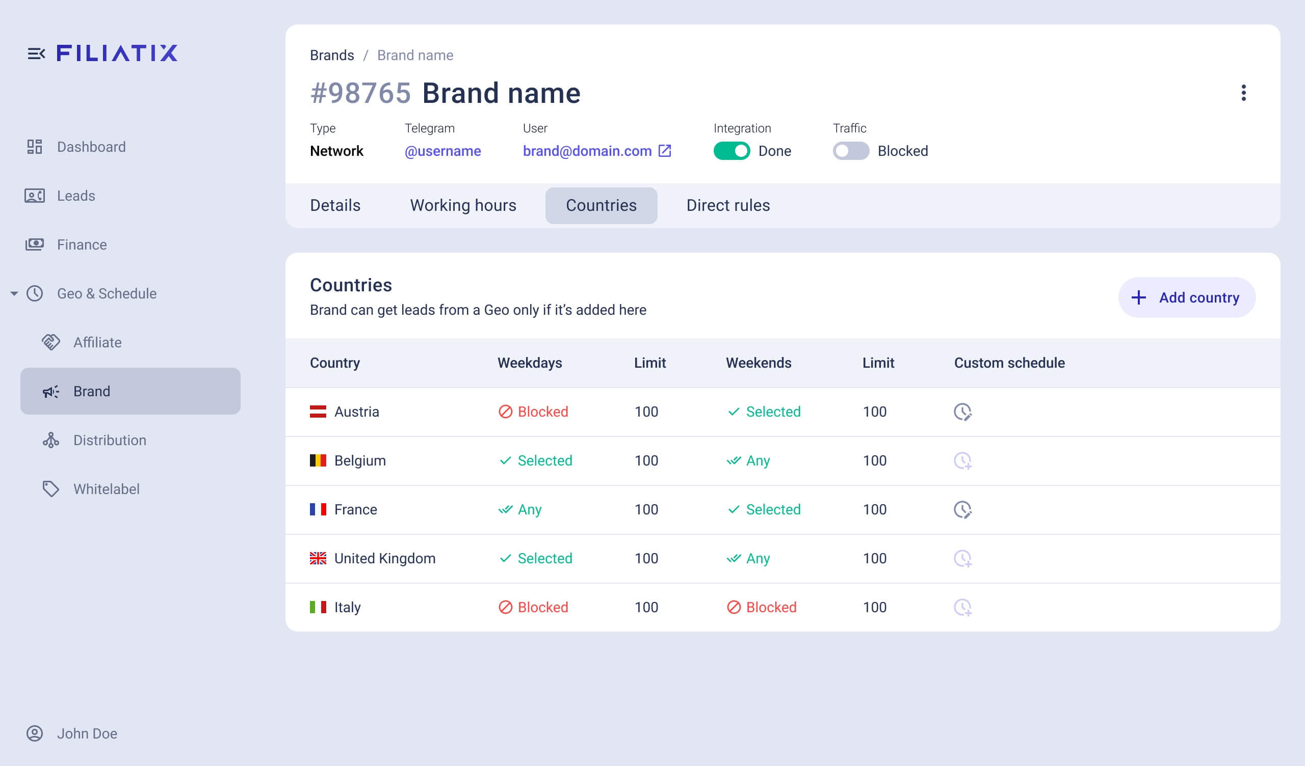
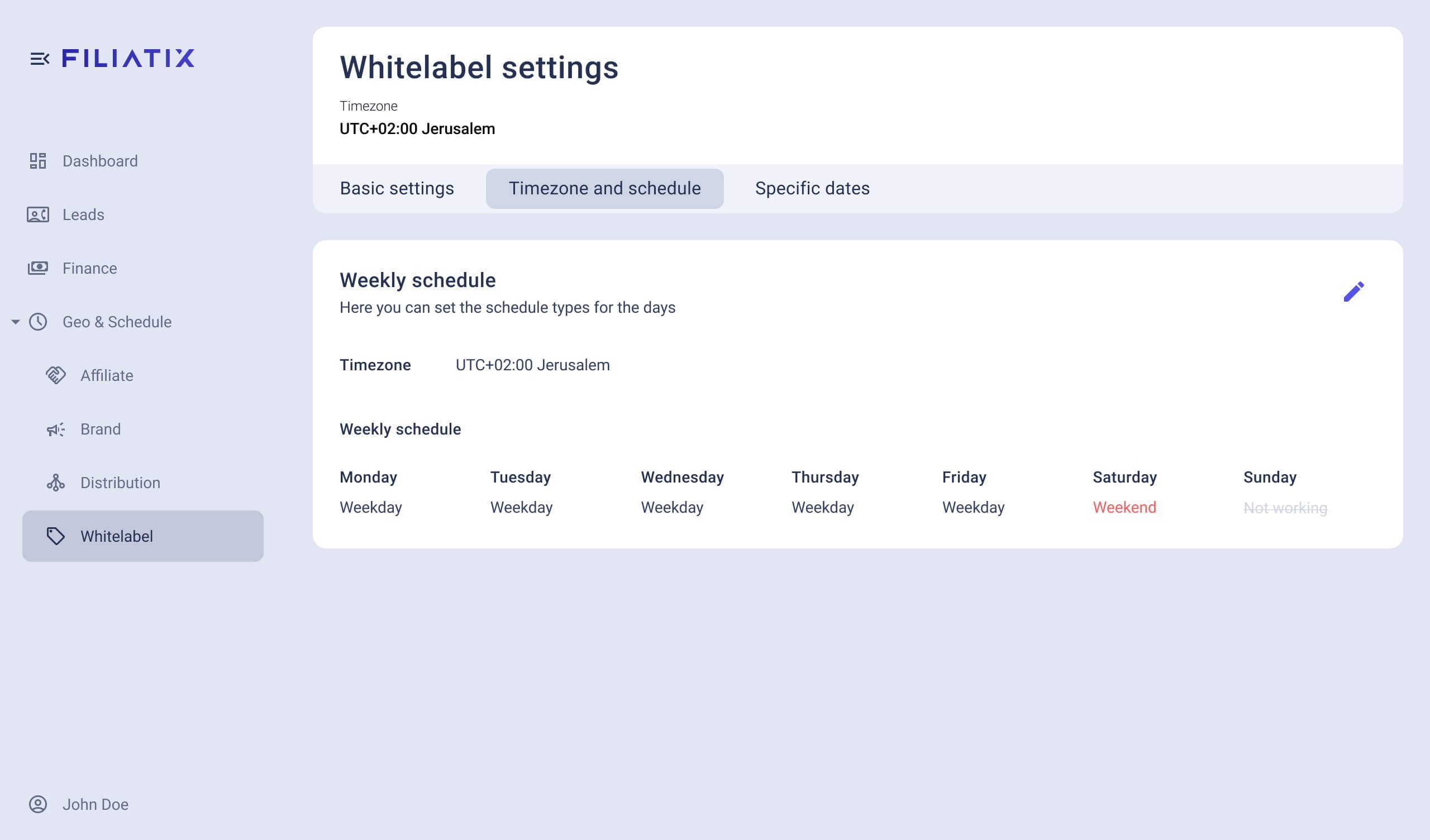
To accelerate the design process and ensure clear communication, I created interactive prototypes in Figma from the very beginning. This wasn't just for the client; it allowed me to immediately test complex component interactions and validate the user flow. By utilizing Figma's prototyping features, I was able to quickly iterate and ensure the logic of the interface was sound before moving forward. The project was built upon an existing Prime React design system, which provided a robust set of components for building complex dashboards. This allowed me to focus on creating a seamless user experience rather than building foundational elements from scratch. However, one key custom component was required: a visual tool for selecting multiple active time periods. Instead of relying on a series of input fields, I designed a custom solution that allows users to visually define multiple time slots, simplifying what would otherwise be a tedious process.
To accelerate the design process and ensure clear communication, I created interactive prototypes in Figma from the very beginning. This wasn't just for the client; it allowed me to immediately test complex component interactions and validate the user flow. By utilizing Figma's prototyping features, I was able to quickly iterate and ensure the logic of the interface was sound before moving forward. The project was built upon an existing Prime React design system, which provided a robust set of components for building complex dashboards. This allowed me to focus on creating a seamless user experience rather than building foundational elements from scratch. However, one key custom component was required: a visual tool for selecting multiple active time periods. Instead of relying on a series of input fields, I designed a custom solution that allows users to visually define multiple time slots, simplifying what would otherwise be a tedious process.
To accelerate the design process and ensure clear communication, I created interactive prototypes in Figma from the very beginning. This wasn't just for the client; it allowed me to immediately test complex component interactions and validate the user flow. By utilizing Figma's prototyping features, I was able to quickly iterate and ensure the logic of the interface was sound before moving forward. The project was built upon an existing Prime React design system, which provided a robust set of components for building complex dashboards. This allowed me to focus on creating a seamless user experience rather than building foundational elements from scratch. However, one key custom component was required: a visual tool for selecting multiple active time periods. Instead of relying on a series of input fields, I designed a custom solution that allows users to visually define multiple time slots, simplifying what would otherwise be a tedious process.
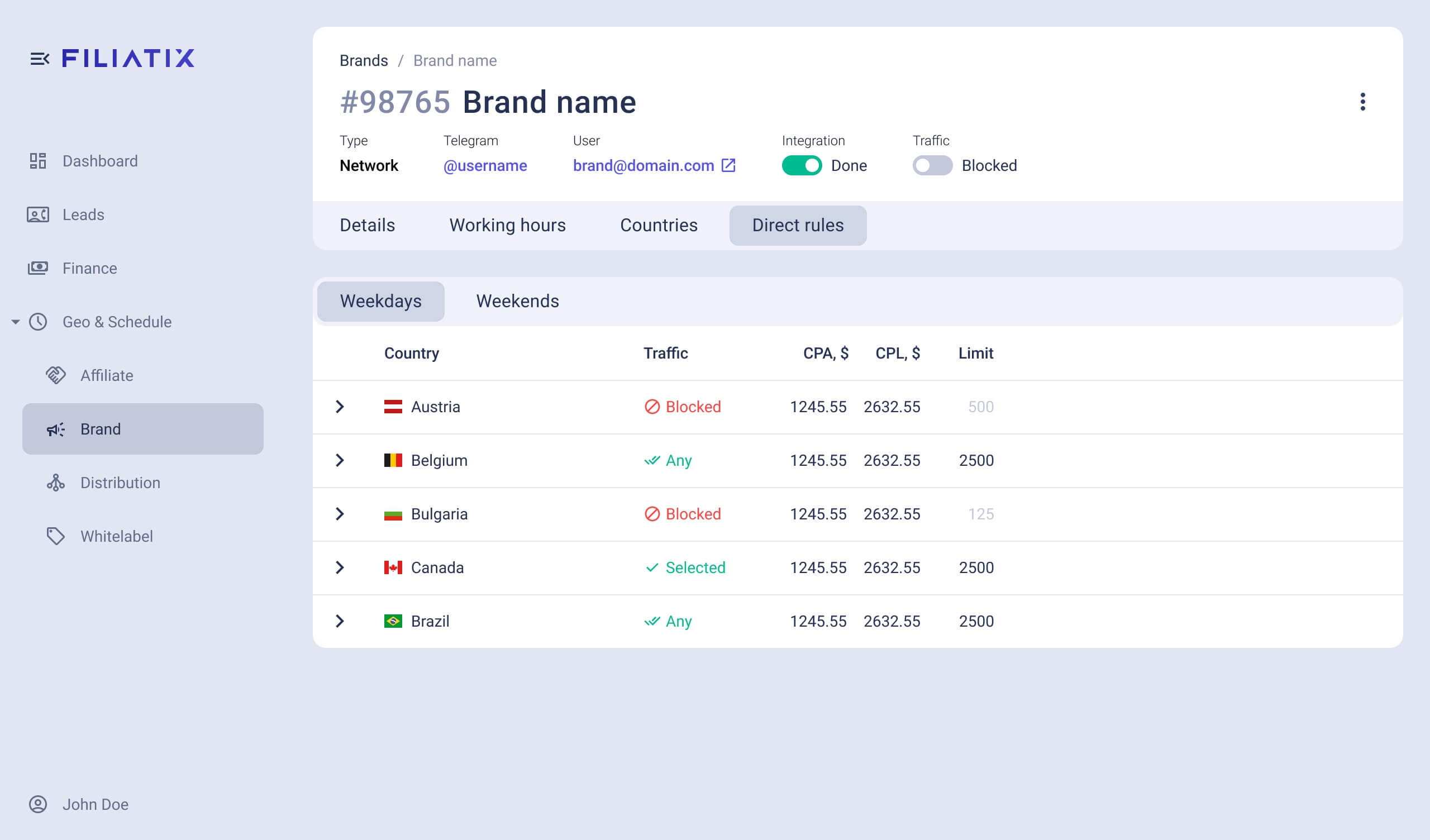
A critical requirement from the client was to prevent accidental input errors, especially since a wrong setting could lead to wasted budget. While users don't typically make many changes in a single session, the design needed to provide a sense of security and control. To address this, I explored several design options:
A critical requirement from the client was to prevent accidental input errors, especially since a wrong setting could lead to wasted budget. While users don't typically make many changes in a single session, the design needed to provide a sense of security and control. To address this, I explored several design options:
A critical requirement from the client was to prevent accidental input errors, especially since a wrong setting could lead to wasted budget. While users don't typically make many changes in a single session, the design needed to provide a sense of security and control. To address this, I explored several design options:
(
Design options
)
(01)
Per-change confirmation
Requiring a confirmation for every single change.
(02)
Inline edits
A faster, but potentially riskier, approach without confirmation.
(03)
Read-only/edit mode
A more controlled approach where users enter an edit mode, make multiple changes, and then apply them all with a single confirmation.
Ultimately, this is a great opportunity for A/B testing. I would recommend testing these different modes on a limited audience to see which one performs best in terms of user satisfaction (e.g., NPS scores) and task completion time. This would also be a great candidate for a user-customizable setting, allowing users to choose the mode that best suits their workflow.
Ultimately, this is a great opportunity for A/B testing. I would recommend testing these different modes on a limited audience to see which one performs best in terms of user satisfaction (e.g., NPS scores) and task completion time. This would also be a great candidate for a user-customizable setting, allowing users to choose the mode that best suits their workflow.
Ultimately, this is a great opportunity for A/B testing. I would recommend testing these different modes on a limited audience to see which one performs best in terms of user satisfaction (e.g., NPS scores) and task completion time. This would also be a great candidate for a user-customizable setting, allowing users to choose the mode that best suits their workflow.

Play with the prototype
I designed this to be highly interactive, so feel free to click around and test the key features.


Play with the prototype
I designed this to be highly interactive, so feel free to click around and test the key features.
Play with the prototype
I designed this to be highly interactive, so feel free to click around and test the key features.
Project File Breakdown
Dive into the project's structure, from the overall layout to the individual components. You'll notice my commitment to organized and logical naming for layers, frames, and variables, which is crucial for developer handoff and team collaboration.
Project File Breakdown
Dive into the project's structure, from the overall layout to the individual components. You'll notice my commitment to organized and logical naming for layers, frames, and variables, which is crucial for developer handoff and team collaboration.
Project File Breakdown
Dive into the project's structure, from the overall layout to the individual components. You'll notice my commitment to organized and logical naming for layers, frames, and variables, which is crucial for developer handoff and team collaboration.
(
Numbers
)
(01)
Competitive Analysis
I would research competitor products, analyzing user reviews and conducting interviews with their users to identify what works and what doesn't.
(02)
Competitive Analysis
I would research competitor products, analyzing user reviews and conducting interviews with their users to identify what works and what doesn't.
(03)
A/B Testing
I would continue to run A/B tests to optimize the interface, focusing on key metrics such as user satisfaction ratings and session duration.